
Developing CRISP: A design system to streamline and enhance the user experience across our digital products
I undertook the challenge of developing a comprehensive design system to streamline and enhance the user experience across our digital products.
The Problem: Lacking… all of it

This is me at the beginning of all this.
Goals
1
consistency
Create a cohesive and consistent design language across all digital products
2
Efficiency
Streamline the design and development process to reduce redundancy and speed up product iterations
3
scalability
Develop a flexible design system that accommodates the growth and evolution of our product portfolio
4
improved quality
As adoption grows, so does the consistency of delivered designs and code, aiming to reduce timelines
Approach
We took a three-fold approach to addressing each layer of the design system. Within each layer, there are assets, documentation, and processes at play. One cannot function well without its counterparts.

Stakeholders
We had a lot of freedom to pursue treating our design system like a product, but we were still beholden to stakeholders to ensure we were meeting their needs as users, deciders, implementers, or maintainers of the system.

Why CRISP?
Upon first glance, you may think CRISP has something to do with delicious chicken nuggets. While I wish this were true, CRISP is actually an acronym of the principles we wanted to champion with our design system.
centralized
🌎
reusable
♻️
inclusive
🤝
semantic
📕
progress
📈
Solution
The solution required developing and advocating for the adoption of a design system across the product portfolio
1
Discovery
Discovery of needs based on a UX audit and facilitating a workshop with the design and product management teams.
3
define
Define comprehensive set of design tokens to standardize variables such as colors, typography, spacing, and more.
2
build
Build a library of reusable UI components that could be easily implemented across various screens and applications.
4
document
Document design patterns for common user interactions and flows to ensure a consistent and intuitive user experience.
Prioritization
I organized a workshop involving product managers and designers. Together, we mapped customer feedback related to the interface using a prevalence vs. impact matrix. This exercise helped map out the initial design system backlog and provided a clear starting point for our work.
Putting it Together
Foundations
Below are some of the foundational elements that were defined — from logo usage to tone of voice for our product copy/content to ensure it matched our marketing and customer education voice.
What do you do when your brand colors are 💩 to work with?
Peep this interesting problem we encountered
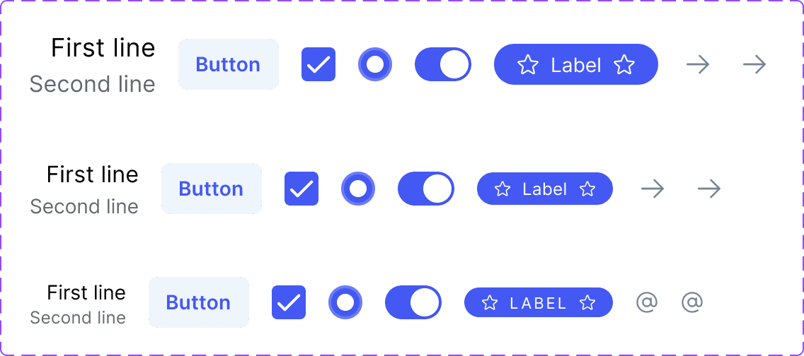
Tokens
Praise be the design token — a symbol of unity among designers and developers. Where once was discord, there is now jubilation for a shared language. We held a naming convention workshop to work through different ways of naming tokens with what fit best with our products.
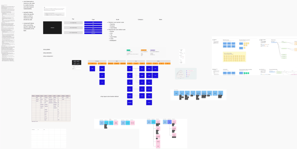

Name all the things!!!
At the end of our workshop, this was the direction we went with as general guidelines to break down naming a token and the cascade of granularity.


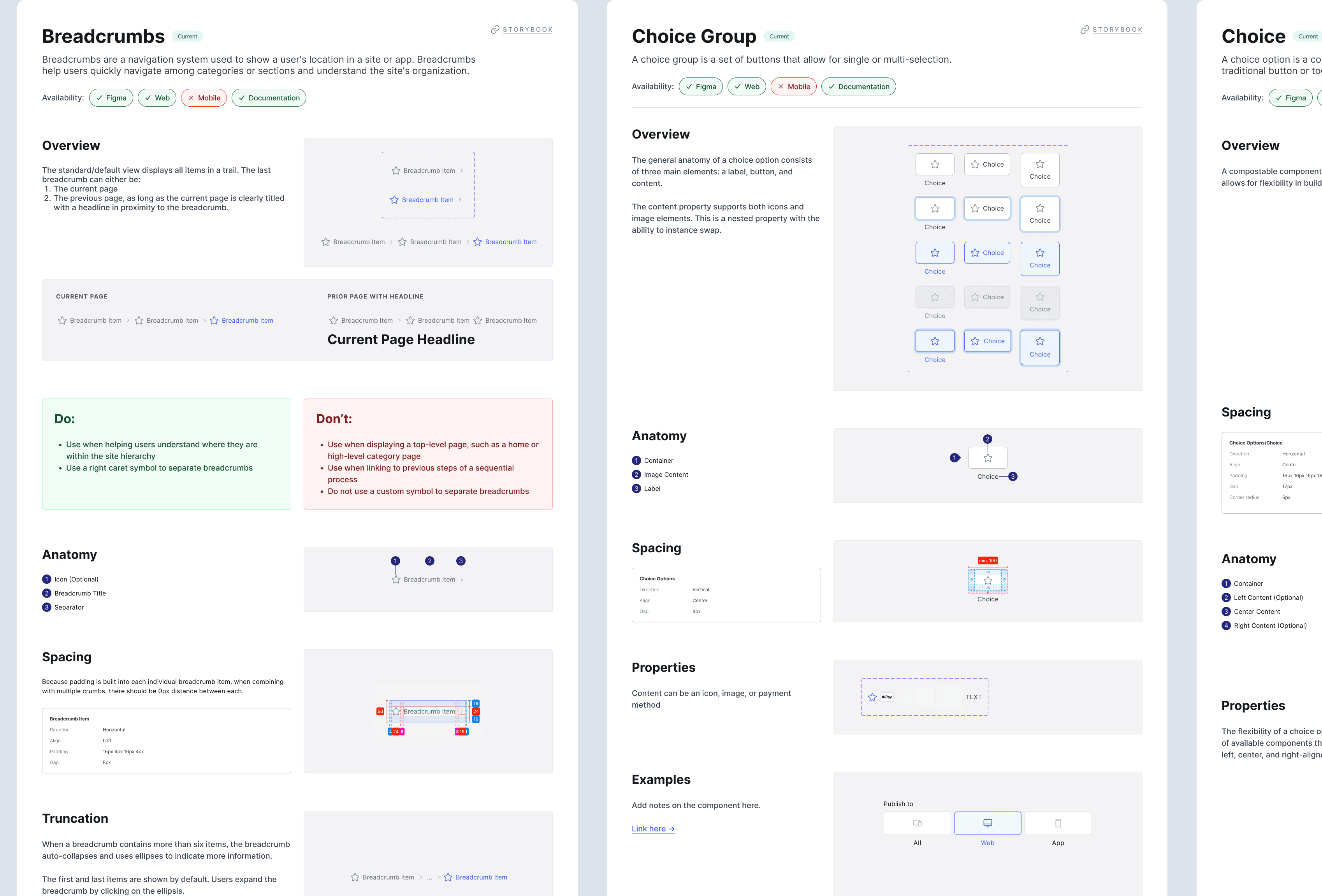
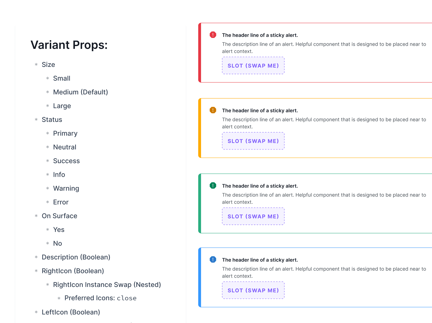
Documentation


Processes & Governance: Areas of Focus
There were three areas of focus when it came to developing and managing processes and governance around the system itself: adoption, contribution, and maintenance. These areas emphasized there is not only the initial adoption of the system, but continued maintenance to keep it going, and contribution to help it grow.
Adoption
🐶
Training engineering squads on using Storybook & accessing the repo in Github
Aligning with Customer Education and People Ops teams who create their own graphics on the system
Maintenance
🧹
Weekly sync between main contributors to show code, designs or documentation, stress test beta components
Open office hours during weekly sync & slack channel for Q&A and updates to the system
Ensure stability of component builds & tokens with new feature releases in Figma
contribution
➕
Developed a contribution model for anyone to submit to
Visibility into JIRA and ProductBoard to show roadmap and planned releases
Reference/link system work to respective squad's sprint goals

Our contribution model was inspired by Nord Health and Zalando's.


Challenges
😓 Complex Product Architecture and Tech Stack
⏰ Demanding Deadlines
🏜 Lack of Dedicated Resources
🎨 Lack of Cohesion Between Brand and Existing Product
Impact
50+
components designed, built and documented
100%
adoption rate
⬆️
system-wide update to support vue 3
4
less computers flung out the window by a designer
Future Steps
Added new product to portfolio — begin to support vertical
Conduct audits with UXE to ensure dev teams are utilizing DS as expected. Retrain as necessary
Learnings
This was not my first experience with creating a design system, implementing workflows and processes, or even creating technical documentation, but the biggest learning experience for me was the mathematical application behind color theory and the human perception of color and light. I dove a lot deeper into creating color ramps and harmonious palettes that are brand respectful, translate the natural perception of color to screen, and create consistent luminosity.
Kristin Ferrari © 2025