

Improving Product Discoverability
CommentSold is an all-in-one solution to help small businesses grow to the next level by providing users with e-commerce capabilities to effectively manage & cultivate their online, live-selling presence.
I was responsible for defining and executing a solution to improve product discoverability on our white-labeled apps that utilized Google’s established product taxonomy while maintaining retailers’ ability to create custom collections.
Team
Product Design: Kristin Ferrari, Jenessa Loche
Principal Product Manager: Jon Nguyen
iOS + Android Leads: Nick DellaValle, Erik Schwitters
Methods
Secondary Research
Wireframing
Prototyping
UI Design
User Testing
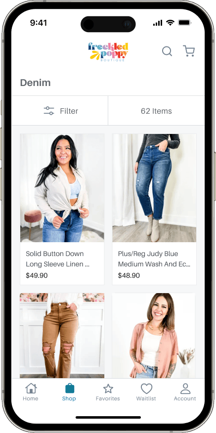
The Problem: Inefficient Categorization
There's a lot of different terms related to groups of products — let's clear up what each one means…
Product Collection: A curated group of products that are related by a common theme, topic or attribute, for example, "Fall Favorites"
Product Selection: A curated group of products manually picked specifically for a livestream sale. Selections are unique to CommentSold. Ex. "Thursday Night Live"
Product Category: A group of similar products that share related characteristics and help define the overall taxonomy of a store. Ex. "Sweaters"
Why is Product Taxonomy Important?
Over 41% (Baymard) of sites perform poorly when it comes to a user’s ability to find a suitable product, with an astounding 88% of sites performing “mediocrely” or worse when it comes to category taxonomy. Adverse taxonomy can cause immediate site abandonment and permanent brand damage.
On mobile devices, the situation is even more challenging. Due to limited screen space, it is crucial for a website to have a well-structured product hierarchy. This includes having a reasonable number of subcategories (around 10) under each parent category. The combination of scrolling and minimal information scent makes it difficult for users to get an overview of the site's navigation structure or understand the offerings on each page.

vs.

User Frustrations
Shoppers and retailers alike were frustrated by the limitations in place in both BOH and FOH operations.
Key Insights
Sourcing feedback from our customer growth team and support tickets, we noticed two recurring themes.
1
Lack of taxonomy
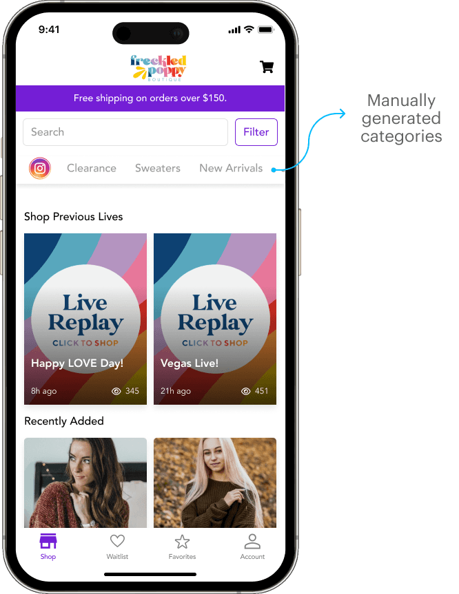
There was little guidance for retailers on how to structure their product categories. Retailers could only create parent collections and couldn’t create intermediary collections.
2
Limited Discoverability
Lack of intuitive navigation within the app prevented users from browsing for products unless they knew the specific product title. They sometimes don’t even know where to start.
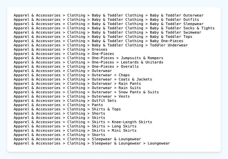
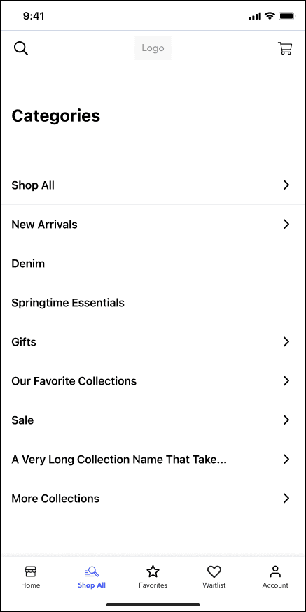
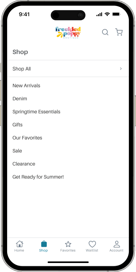
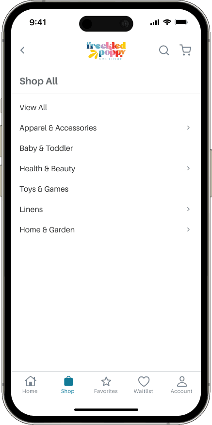
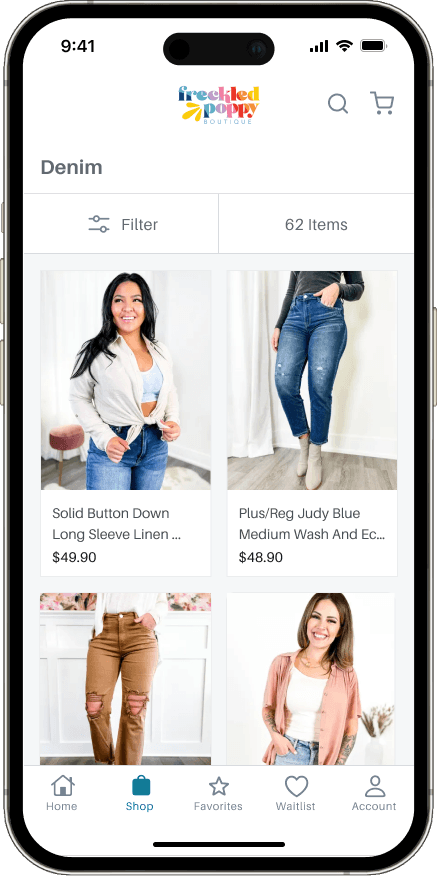
The Solution: Support Product Taxonomy through a “Shop All” Feature Using Google Product Categories
Adopting the predefined taxonomy Google created for their e-commerce products, we decided to build out a new product hierarchy housed underneath a new navigation item labeled “Shop All”.
Why Google?
They have a robust taxonomy that retailers are already familiar and engage with
Retailers utilize Google ad integrations and other Google products
Allows for seamless syncing of inventory from 3rd parties that also utilize Google taxonomy
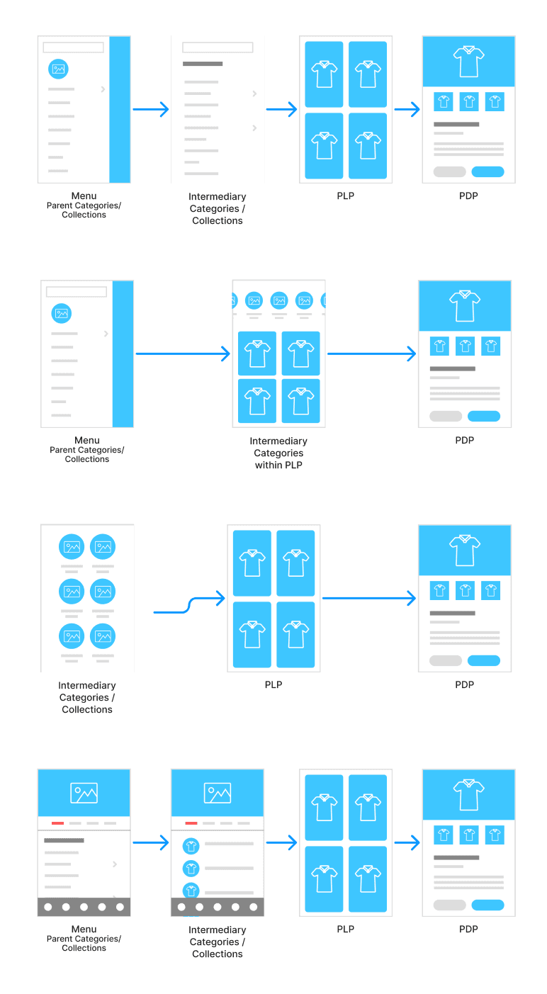
Part 1: Where Does "Shop All" Reside?

Highlight of some of the secondary research conducted
The first task was to figure out where we would put "Shop All". We took to looking at a wide range of other e-commerce apps to determine what type of patterns we were seeing and what would work best for our users. We came up with three potential locations:

Part 2: Category Browsing
Then, we needed to figure out what pattern would be best for our users to actually drill down through the new layered categorization.
Technical Considerations
We recently released a new feature for shops to be able to create custom designed homepages for their apps. Because this could also be the homepage for their website, this had to be treated as an embed of a non-native interface. Our solution needed to take into account a potential change in programming language.

Stress Testing Flows


What We Found…
1
Bottom Navigation
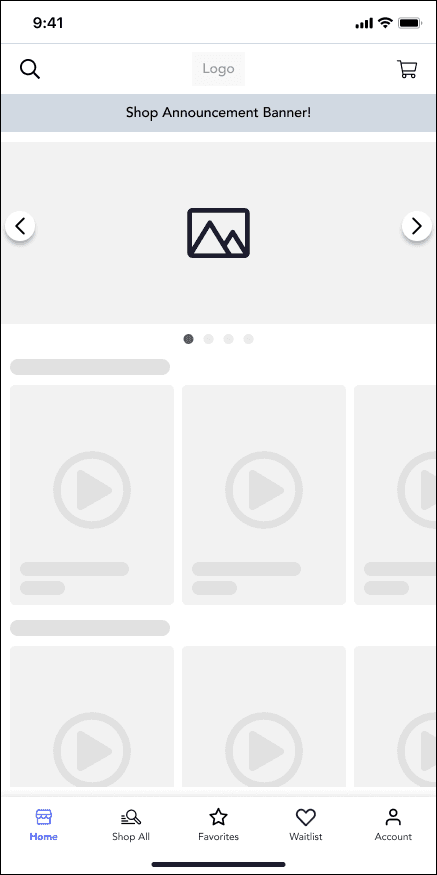
Users intuitively went to the Shop button on the bottom navigation to browse.
2
More Pictures = More Work
More visual layouts for categories were met with resistance from retailers. They did not want to manage category level imagery.
3
Collections & Categories
Retailers liked that they could still feature curated collections AND use Google product categories. They liked that they could pick which categories to display in the admin.


Future Steps
Planned Release: Slated for release after large technical debt completed for Android.
P1, P2…: Improved filtering, including support for product types.
Webstore Support: Implement category taxonomy to webstores
Learnings
This was a lesson in attention to detail and user interaction. When we were working on this, we felt confident because this is a common user experience in e-commerce. Little did we know that we’d come to find there were several different nuances that affected what the best outcome would be for both our retailers and their customers. What works for a large corporation like Target did not work for our user base.
Kristin Ferrari © 2025