
Sunscape Resorts & Spas Gets a Facelift
The Opportunity: Turn A Technical Migration into an Improved Brand Experience
The original website SunscapeResorts.com was built on an open-source content management system, Joomla. Throughout the years of exponential growth, it became clear that a more robust solution was necessary to handle content maintenance. Additionally, the site was not accessible, not mobile-friendly, had a complex information architecture, and did not showcase the beautiful imagery and visuals that we had for these resort properties.
Goals
1
Streamline content creation, modification, and publishing processes for content editors.
2
Enhance site architecture to cater to both research-oriented users and those with the intent to make a purchase.
3
Ensure the branding aligns with Web Content Accessibility Guidelines (WCAG) for improved accessibility.
4
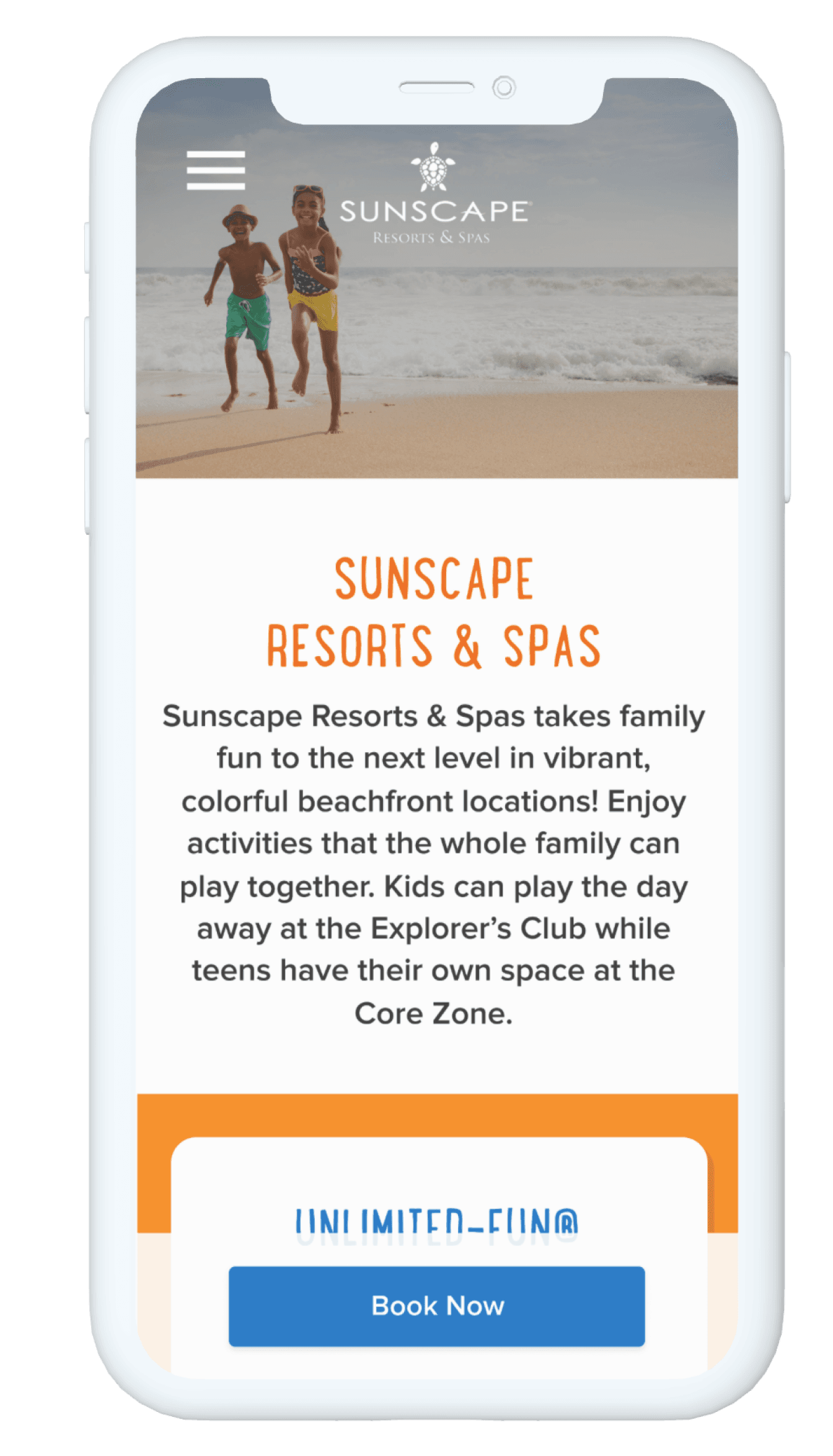
Design a responsive site for a more mobile-friendly experience.
Understanding Our Users & Brand
Supporting the Lead UX Designer, we made a coordinated effort to learn more about the brand's perception, our competitive landscape, and our current users (both externally and internally).
Competitive Analysis & Heuristic Evaluation
The UX designer completed an evaluation of 24 different all-inclusive resort competitors.
Stakeholder Interviews
Stakeholder interviews provided insight into key team members' expectations for the brand, user experience, and content authoring.
Brand Personas
Stakeholder interviews provided insight into key team members' expectations for the brand, user experience, and content authoring.


Key Insights
Insights gleaned from these methodologies:
1
reduce top-level navigation items
Users become overwhelmed by the number of choices they have. We pinpointed the most visited pages (Accommodations, Photo Galleries).
2
drive users to resort/property pages
The brand level pages don't give users enough information to make informed decisions, and bounce rate was more prevalent on these pages.
Design Principles
Based on stakeholder interviews, our brand personas, and competitive analysis, we developed design principles to guide our work:
Elevated
⬆️
While the brand is family-friendly, primary vacation bookers are parents. Elevate the brand so it appeals to adults and children.
Integrity
💪
Maintain the existing integrity of the brand. There should still be a childlike element.
Approachable
👋
While this is the most affordable of the AMResorts brands, it is still considered four star. Don’t cheapen the brand.
Vibrant
🌈
The brand, overall, is fun! The resorts themselves are very colorful and located in unique destinations.
Accessible
🌎
Part of why we were doing a redesign was because the site was not accessible. We needed to update the brand’s digital guidelines to improve accessibility. Internally, we needed to make the content editing workflow much more inclusive so that not only designers could make updates, but the responsibility could be placed with brand, marketing and communications teams.
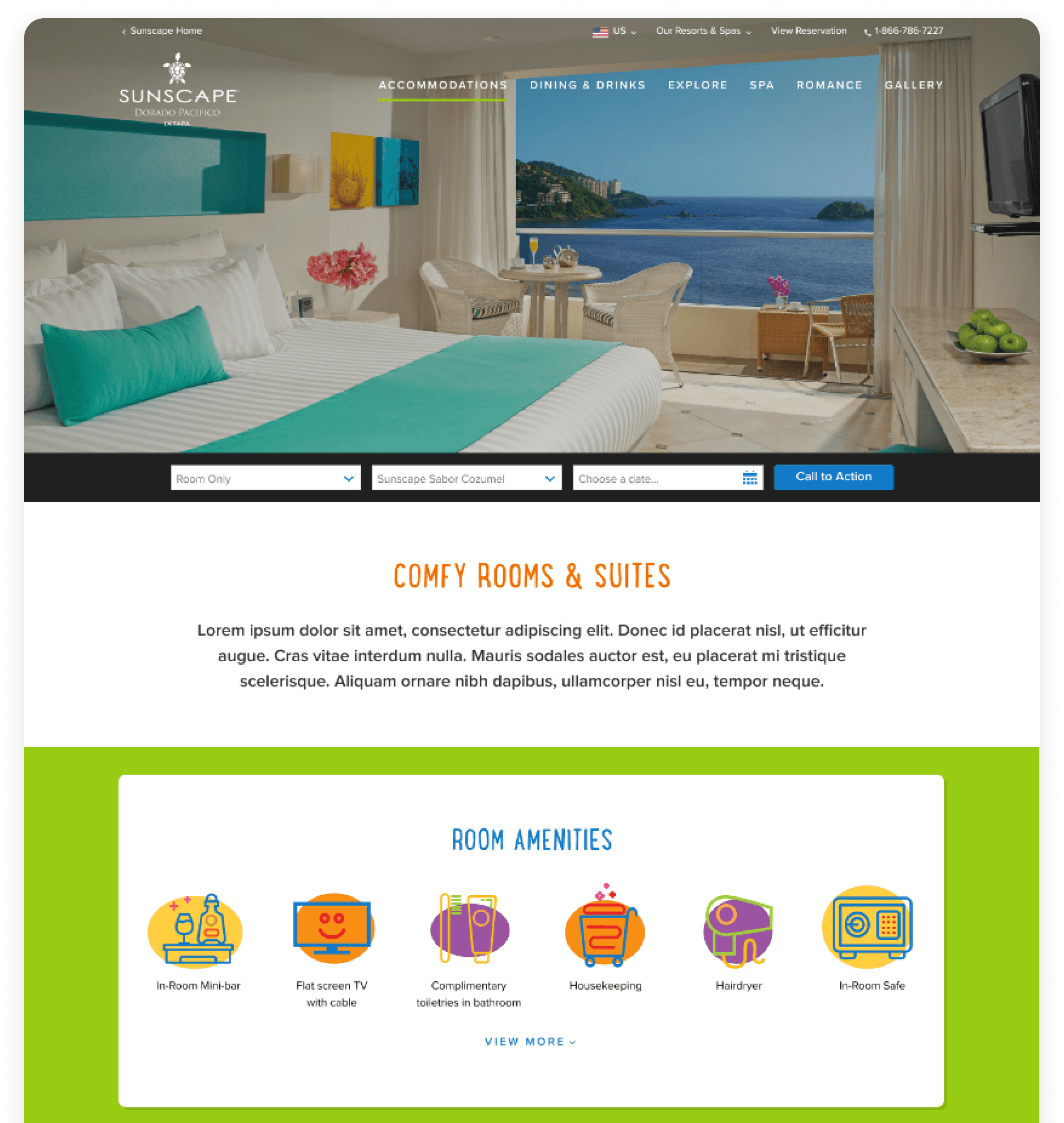
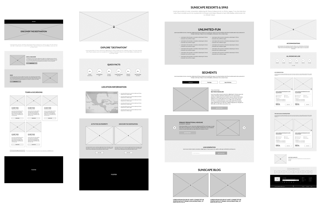
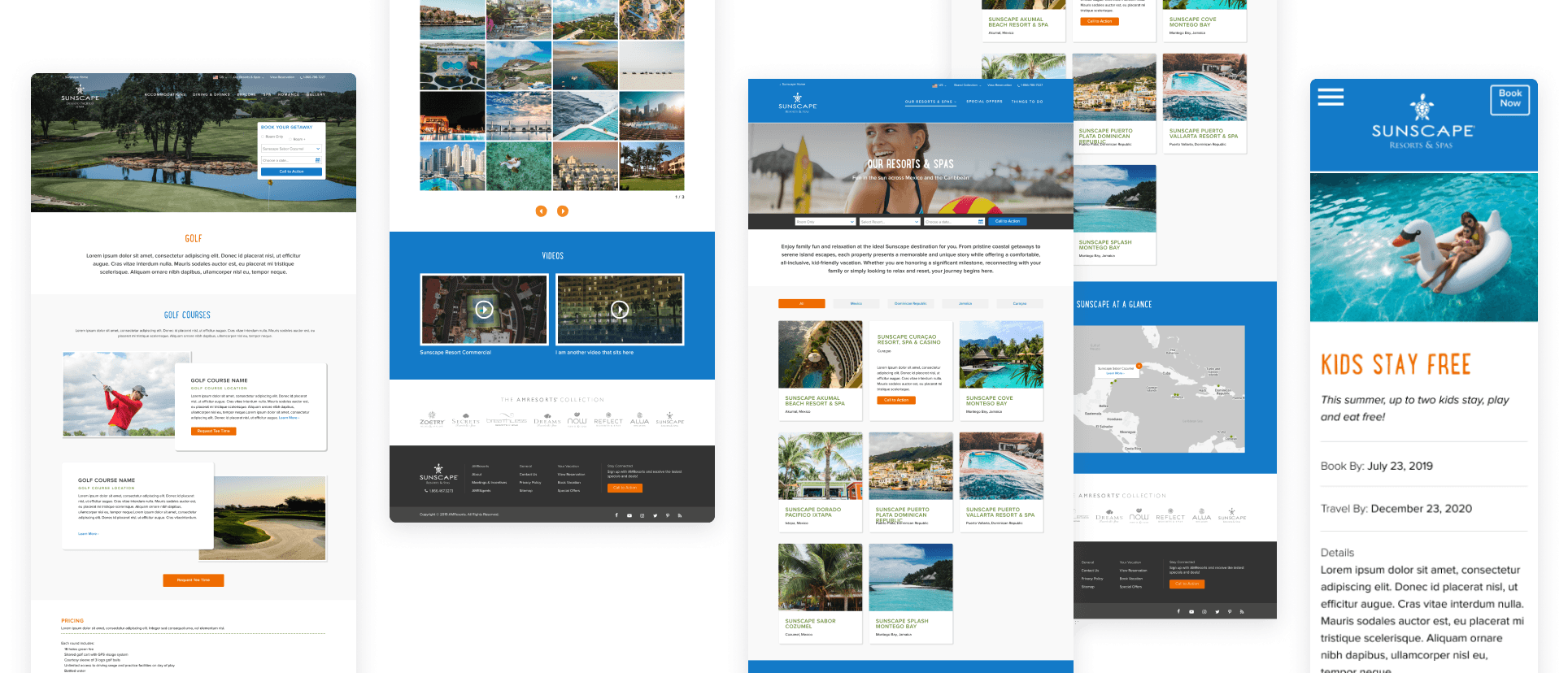
Working with the UX Designer and Product Marketing Managers, a new site map was created, now with greater emphasis on the information users are seeking the most: types of accommodations and their price points, the inclusions of a booking, photos of the properties, and applicable offers.

Brand Highlights
Typography & Color
We maintained consistency with the existing branding while establishing a clear typographical hierarchy across components. This approach ensured a uniform usage throughout the website, regardless of placement or order within a page. We also attached specific styles to header tags to improve accessibility and search rankings.
The color palette underwent refinements to meet compliance guidelines. A distinct supporting palette was introduced exclusively for illustrations, deliberately kept separate from the brand's overall identity. This addition not only enriched the site's visual states but also contributed to an expanded color spectrum, complementing the newly adopted iconography style. These adjustments collectively ensured a visually engaging and compliant design, elevating both user experience and brand aesthetics.

Components

Et Voila!
Challenges
💪 Maintain Brand Integrity
🎨 Color Compliance
🔀 Versatility & Adapability
Impact
The website is now built from a data-driven, headless structure so that any information that is repeatable can be utilized on another website and not have to be rebuilt. This increases the efficiency of the content authoring team and reduces the possibility of human error.
Learnings
I learned to think systemically across both BOH and FOH for internal and external users. How the information is visually displayed to users on the website depends on how well we provide content authors with the flexibility to succeed in their tasks, and give guidance, direction and implement guardrails where needed.
I also learned that traditional illustration is definitely a whole different ballpark than illustrating letters and now I know to stay in my lane.
Kristin Ferrari © 2025